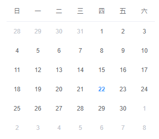
日历布局,顾名思义,就是像日历一样的布局。。长的大概像下面(来自ElementUI):
看到行数和列数都固定的这种布局,首先会想到的就是使用表格去做。但是作为前端,要学会不走寻常路。我们会在本文中尝试使用强大的CSS Flex实现这种布局。
日历布局设计
日历布局是一个7栏6列的布局。其中每一个日期元素高宽均为30px,每一个日期元素与其相邻元素之间距离10px。边界上的日期元素与日历容器元素的边框相距10px。大概长得向下面这样。(偷懒没有把尺寸标明上去。)
Level 1:使用Table布局
使用table实现这一种布局非常简单,首先我们先把HTML文档写出来:
1
2
3
4
5
6
7
8
9
10
11
12
13
14
15
16
17
18
19
20
21
22
23
24
25
26
27
28
29
30
31
32
33
34
35
36
37
38
39
40
41
42
43
44
45
46
47
48
49
50
51
52
53
54
55
56
57
58
| <table>
<tbody>
<tr>
<th>日</th>
<th>一</th>
<th>二</th>
<th>三</th>
<th>四</th>
<th>五</th>
<th>六</th>
</tr>
<tr>
<td>1</td>
<td>2</td>
<td>3</td>
<td>4</td>
<td>5</td>
<td>6</td>
<td>7</td>
</tr>
<tr>
<td>8</td>
<td>9</td>
<td>10</td>
<td>11</td>
<td>12</td>
<td>13</td>
<td>14</td>
</tr>
<tr>
<td>15</td>
<td>16</td>
<td>17</td>
<td>18</td>
<td>19</td>
<td>20</td>
<td>21</td>
</tr>
<tr>
<td>22</td>
<td>23</td>
<td>24</td>
<td>25</td>
<td>26</td>
<td>27</td>
<td>28</td>
</tr>
<tr>
<td>29</td>
<td>30</td>
<td>31</td>
<td></td>
<td></td>
<td></td>
<td></td>
</tr>
</tbody>
</table>
|
然后,我们利用border-spacing属性指明表格项边框之间的距离为10px:
1
2
3
4
| table {
background: aqua;
border-spacing: 10px;
}
|
注意到要求日期元素的高宽为30px,那么这里的高宽是指height,width吗?显然在这里高宽应该是指Border Box的高度与宽度,因此,我们将box-sizing设为border-box。
1
2
3
4
5
6
| td,
th {
width: 30px;
height: 30px;
box-sizing: border-box;
}
|
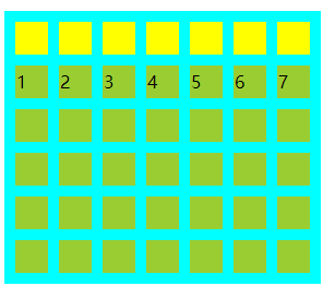
然后,emmm,没有然后了。为了明显,我们将th,td加上背景色,效果如下:

Level 2: 多层嵌套纯CSS Flex实现
接下来,我们来考虑纯CSS Flex实现。首先我们可以看到日历组件是可以分为两个部分的,一个以垂直方向排列的日期行,而日期行里面是水平排列的日期项。由这个想法我们很容易想出一个嵌套flex容器的布局。HTML文档如下:
1
2
3
4
5
6
7
8
9
10
11
12
13
14
15
16
17
18
19
20
21
22
23
24
25
26
27
28
29
30
31
32
33
34
35
36
37
38
39
40
41
42
43
44
45
46
47
48
49
50
51
52
53
54
55
56
| <div class="flex-wrapper">
<div class="flex-row-wrapper">
<div class="cell">日</div>
<div class="cell">一</div>
<div class="cell">二</div>
<div class="cell">三</div>
<div class="cell">四</div>
<div class="cell">五</div>
<div class="cell">六</div>
</div>
<div class="flex-row-wrapper">
<div class="cell">1</div>
<div class="cell">2</div>
<div class="cell">3</div>
<div class="cell">4</div>
<div class="cell">5</div>
<div class="cell">6</div>
<div class="cell">7</div>
</div>
<div class="flex-row-wrapper">
<div class="cell">8</div>
<div class="cell">9</div>
<div class="cell">10</div>
<div class="cell">11</div>
<div class="cell">12</div>
<div class="cell">13</div>
<div class="cell">14</div>
</div>
<div class="flex-row-wrapper">
<div class="cell">15</div>
<div class="cell">16</div>
<div class="cell">17</div>
<div class="cell">18</div>
<div class="cell">19</div>
<div class="cell">20</div>
<div class="cell">21</div>
</div>
<div class="flex-row-wrapper">
<div class="cell">22</div>
<div class="cell">23</div>
<div class="cell">24</div>
<div class="cell">25</div>
<div class="cell">26</div>
<div class="cell">27</div>
<div class="cell">28</div>
</div>
<div class="flex-row-wrapper">
<div class="cell">29</div>
<div class="cell">30</div>
<div class="cell">31</div>
<div class="cell"></div>
<div class="cell"></div>
<div class="cell"></div>
<div class="cell"></div>
</div>
</div>
|
其中,div.flex-wrapper是最外层的flex容器,它的主轴方向是垂直的。为了边缘元素与容器元素边界的10px间隙。我们在这里使用padding: 10px实现这一要求。接下来是行之间的间隙如何解决。注意到,CSS Flex里有一个justify-content: space-between,可以将头尾两个元素分别放置在主轴的头尾两端,其他元素之间的间隙相等,间隙的大小由空余空间自动计算。这个特性非常适合用来解决行之间间隙的问题。我们只需要计算6个30px高度的行,加上行间10px间隙需要多少高度即可,答案是6 * 30px + 5 * 10px = 230px。由此,我们可以这么写.flex-wrapper的样式:
1
2
3
4
5
6
7
| .flex-wrapper {
display: flex;
flex-flow: column;
padding: 10px;
justify-content: space-between;
height: 230px;
}
|
接下来考虑行的问题,思考方式同理,只是主轴方向换到水平方向。在按照上面的原理计算完所需宽度之后,这个值应该作为最外层容器的width。
1
2
3
4
5
6
7
8
9
10
11
12
13
14
| .flex-wrapper {
display: flex;
flex-flow: column;
padding: 10px;
justify-content: space-between;
width: 270px;
height: 230px;
}
.flex-row-wrapper {
display: flex;
flex-flow: row;
justify-content: space-between;
}
|
最后给.cell指定高宽:
1
2
3
4
5
| .cell {
width: 30px;
height: 30px;
background: yellow;
}
|
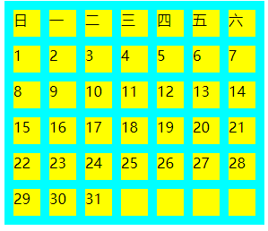
着色之后,效果如下:
没有什么是flex不能解决的,要是有,就再套一层flex。