前几天面试的时候被问到这样一个问题:
如何使用纯CSS Flex实现骰子五点。不能使用position: absolute等绝对定位技巧。实现五点的元素,如div处于同一个嵌套层级。
没答上来,凉了。我真是CSS苦手啊。。。昨晚突然一想,这个好像有解的样子。于是实现了一波。
Level 1: 多层Flex
如果我们不看最后一个约束,即我们可以自由的安排元素之间的嵌套关系,这道题没有什么难度。注意到Flex可以嵌套Flex。我们需要1个大的Flex容器,嵌套2个小的Flex容器(左右两个点)就可以做出来了,代码如下
1
2
3
4
5
6
7
8
9
10
11
12
13
| <body>
<div class="wrapper">
<div class="flex-circle-container">
<div class="circle"></div>
<div class="circle circle-bottom"></div>
</div>
<div class="circle circle-center"></div>
<div class="flex-circle-container">
<div class="circle"></div>
<div class="circle circle-bottom"></div>
</div>
</div>
</body>
|
1
2
3
4
5
6
7
8
9
10
11
12
13
14
15
16
17
18
19
20
21
22
| .wrapper {
width: 100px;
height: 100px;
border: 1px black solid;
display: flex;
justify-content: space-between;
}
.flex-circle-container {
display: flex;
flex-flow: column nowrap;
justify-content: space-between;
}
.circle {
width: 20px;
height: 20px;
background: black;
border-radius: 100%;
}
.circle-center {
align-self: center;
}
|
这里有Demo。
Level 2:纯Flex,无嵌套
当我们要满足所有题目的要求的时候呢,问题就来了。总所周知,Flex布局的核心就是沿着主轴排布元素,元素可以放置侧轴的一些位置上(align-items/align-self)。运用这些特性,我们可以做成五点的大模样,但是不标准。
1
2
3
4
5
6
7
8
9
| <body>
<div class="wrapper">
<div class="circle"></div>
<div class="circle circle-bottom"></div>
<div class="circle circle-center"></div>
<div class="circle circle-bottom"></div>
<div class="circle"></div>
</div>
</body>
|
1
2
3
4
5
6
7
8
9
10
11
12
13
14
15
16
17
18
19
20
21
22
23
| .wrapper {
width: 100px;
height: 100px;
display: flex;
flex-wrap: wrap;
justify-content: space-between;
border: 1px solid black;
}
.circle {
width: 20px;
height: 20px;
border-radius: 100%;
background: black;
}
.circle-center {
align-self: center;
}
.circle-bottom {
align-self: flex-end;
}
|
效果如下:
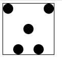
问题在于下面两个点的位置。(好像无解的样子啊,好紧张啊…(面试中的我))
其实我们有一些方式移动元素的位置,当时没有想到。哎…第一,我们可以使用transform去移动下面两个点,第二,我们也可以使用负margin去移动下面两个点。但是所有这些,我们都要先计算出要移动的距离。注意我们使用的justify-content: space-between。它的语义是将头和尾部两个元素放在flex-start和flex-end的位置,然后元素之间的间隙由剩下的空白空间平均分配。在这个例子中,容器宽度为100px,所有flex元素的宽度加起来也为100px (20px * 5)。所以元素之间的空隙为0px。那么我们要移动的距离是多少呢?当然是20px。
依照这个想法,我们先使用transform实现一下:
1
2
3
4
5
6
7
8
9
| <body>
<div class="wrapper">
<div class="circle"></div>
<div class="circle circle-bottom circle-bottom-left"></div>
<div class="circle circle-center"></div>
<div class="circle circle-bottom circle-bottom-right"></div>
<div class="circle"></div>
</div>
</body>
|
1
2
3
4
5
6
7
8
9
10
11
12
13
14
15
16
17
18
19
20
21
22
23
24
25
26
27
28
29
30
31
32
| .wrapper {
width: 100px;
height: 100px;
display: flex;
flex-wrap: wrap;
justify-content: space-between;
border: 1px solid black;
}
.circle {
width: 20px;
height: 20px;
border-radius: 100%;
background: black;
}
.circle-center {
align-self: center;
}
.circle-bottom {
align-self: flex-end;
}
.circle-bottom-left {
transform: translateX(-20px);
}
.circle-bottom-right {
transform: translateX(20px);
}
|
Demo,效果可以。
但是,对于负margin,这里有一点有趣的地方。下面两个点需要-40px才能够做到,可以看Demo。至于为什么?我还需要探索探索。
总结
这里介绍的技巧也许在生产环境中用不着,但是是一个比较好的综合题。嗯。。。(我当时真的想不出来)对Flex中多种布局属性以及元素移动技巧考察还是挺到位的。